Background & Key Issuses
With the growing size of pet households and, with it, the growing size of the market, interest in new products and services for pets conitues to grow. A pharmacist, who was familiar with the needs of pets, wanted to create a brand for pets and needed a strategy to differentiate between the large quantity of pet products. This project aimed to develop brand identity, corporate identity, and pacakge designs centered around the goal of genuinely making prodcuts that can contribute to improving the healthy of pets using only the best ingredients.
Approach & Solution
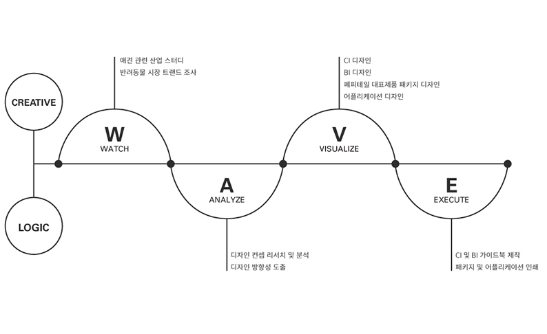
Using peer-to-peer market trend research and competitive market research, we developed the design and guidelines for products based on the key-phrase "brand that gives warmth and trust."

Establishing an overall strategy using P-WAVE
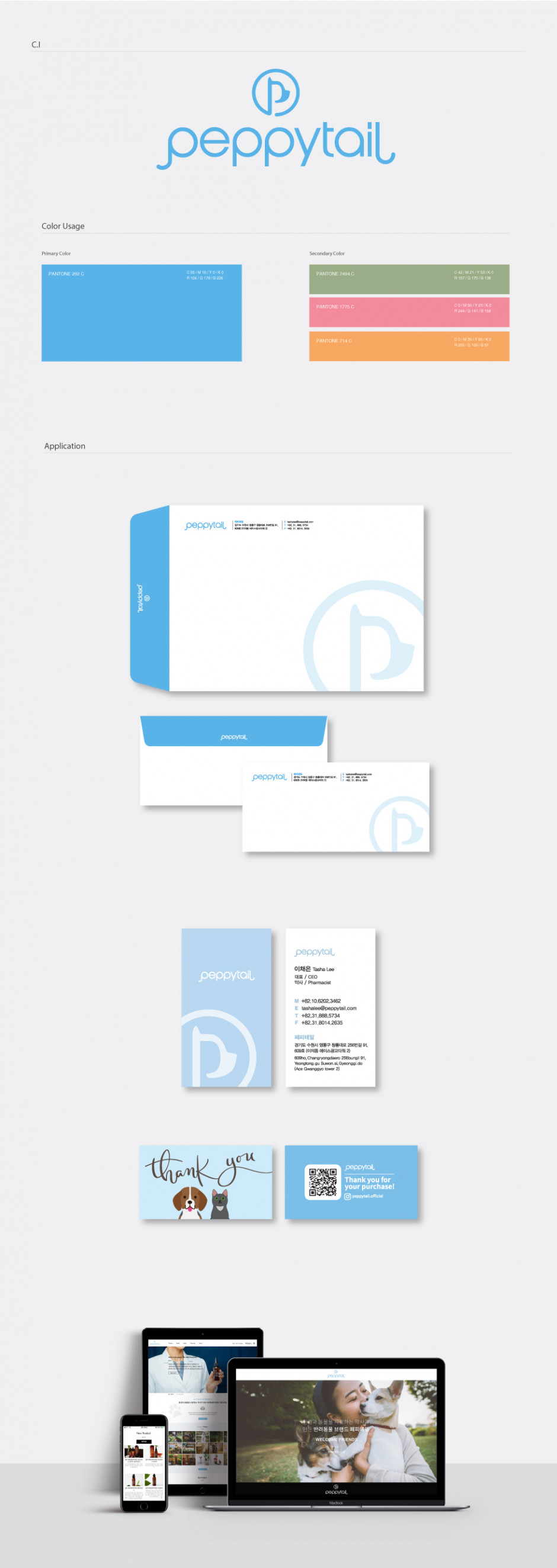
Corporate Identity Design
To make the brand easily recognizable as a pet product brand, the P of Peppytail is shaped to resemble the side view of a pet. Also, the curvature of the logo resembles a tail, which represent the meaning of Peppytail: a lively energetic tail of a beloved pet.
Skin Care Package Design
Peppytail Skin Care is a line of products that contains natural ingredients. Brown containers were used to convey the authenticity of the pharmacist's products, and the raw materials were listed on the fronts of the bottles. Pastel accent colors were used to distinguish the different products while still maintaining a nature-friendly image.
Brand Identity Design
Chamgueonui Myomi is the functional snack brand of Peppytail. The logo was designed using a graphic motif that depicts health, showcasing the care for pet health and pharmacist origin story. The arrangement allowed for a highly versatile application. Meanwhile, blue was used as a special reference to the color that can be seen by both cats and dogs.


