Background & Key Issues
Sewoon Sangga, a building which has undergone many changes in its over 50 year history, was to receive yet another change. This time in the form of a new façade - Signboard Guide
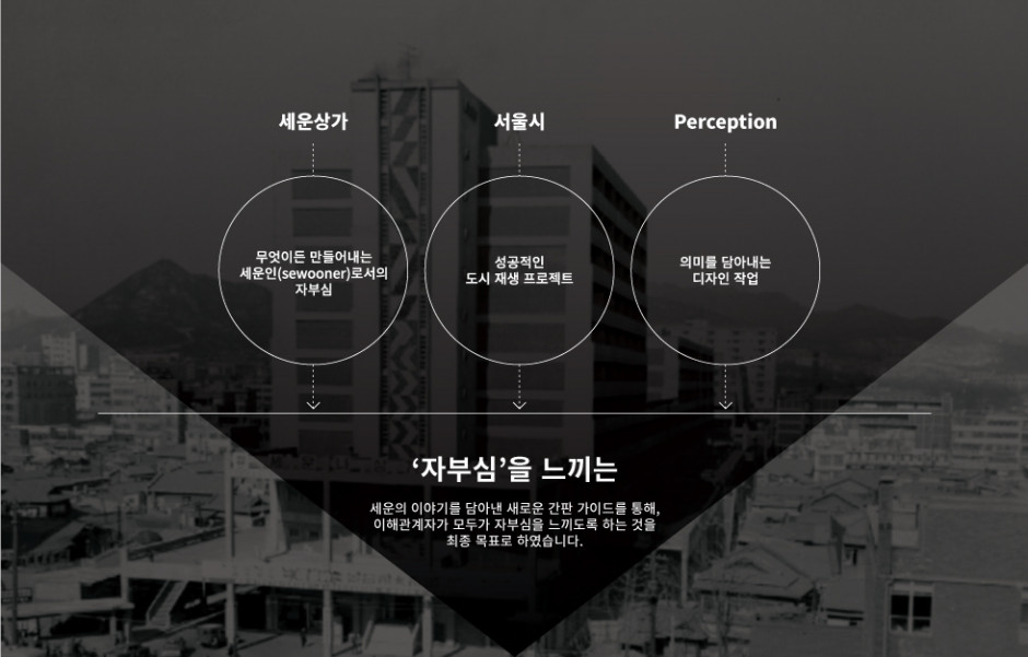
Sewoon Sangga holds a unique place in history, with its "Maker's City" serving as the pinnacle for young entrepreneurs in the 60s and 70s. The goal of this project was to update the signboard while still referencing the poise the building once maintained. In doing so, Sewoon Sangga would once again be the pride of entrepreneurs and the general public alike.
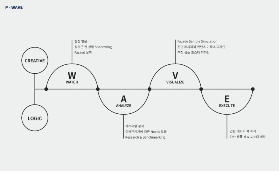
Analyzing the value to be delivered through P-WAVE Strategy
Looking with Fresh Eyes
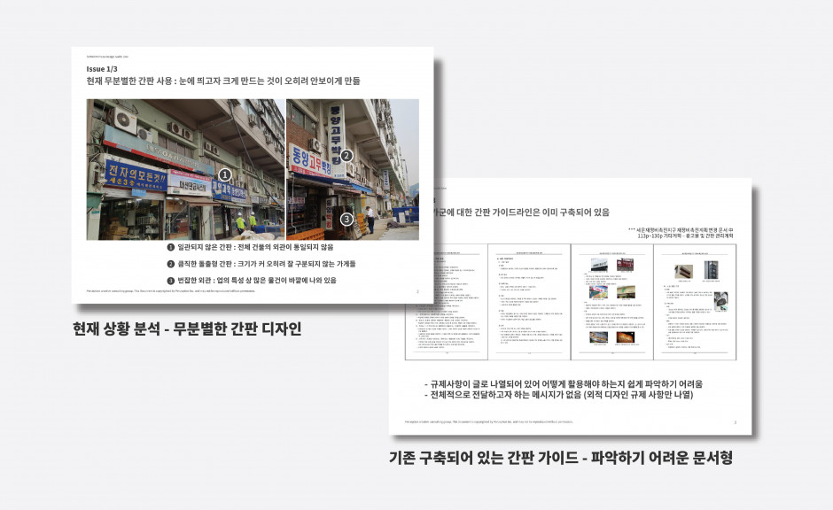
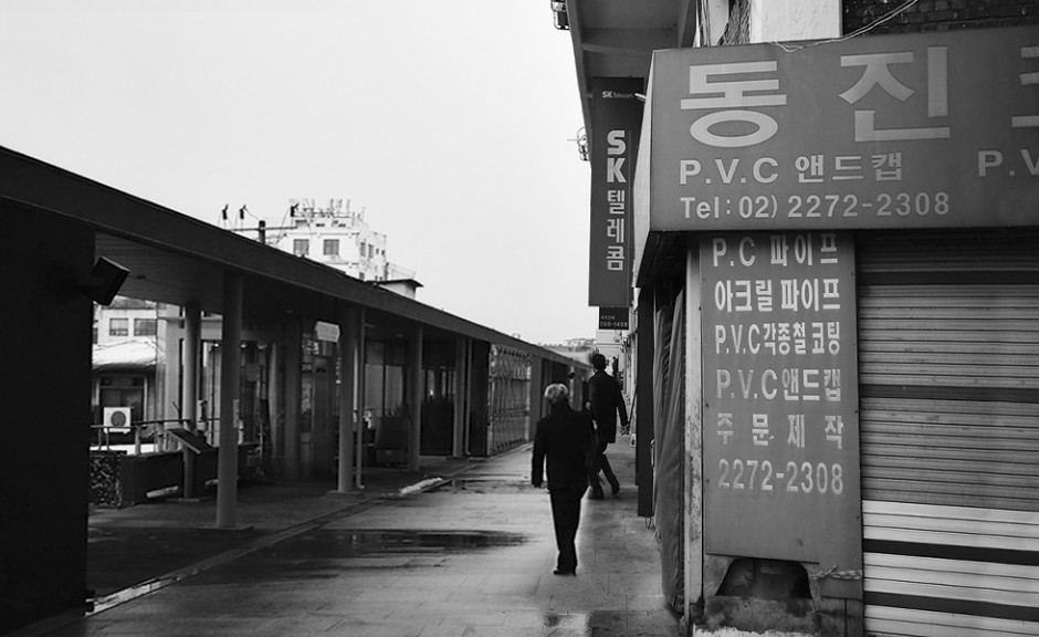
Before creating the guidelines for signage, the current situation was deeply analyzed. The current signs of the Sewoon Sangga location were not unified in appearance due to ageing and inconsistent construction. Additionally, many of the signs went against modern Seoul City laws regarding signage.
In a previous project, design guidelines were set for the building, however only in writing. This project, therefore, aimed to make a more user-friendly and straightforward design regarding signage.
Approach & Solution
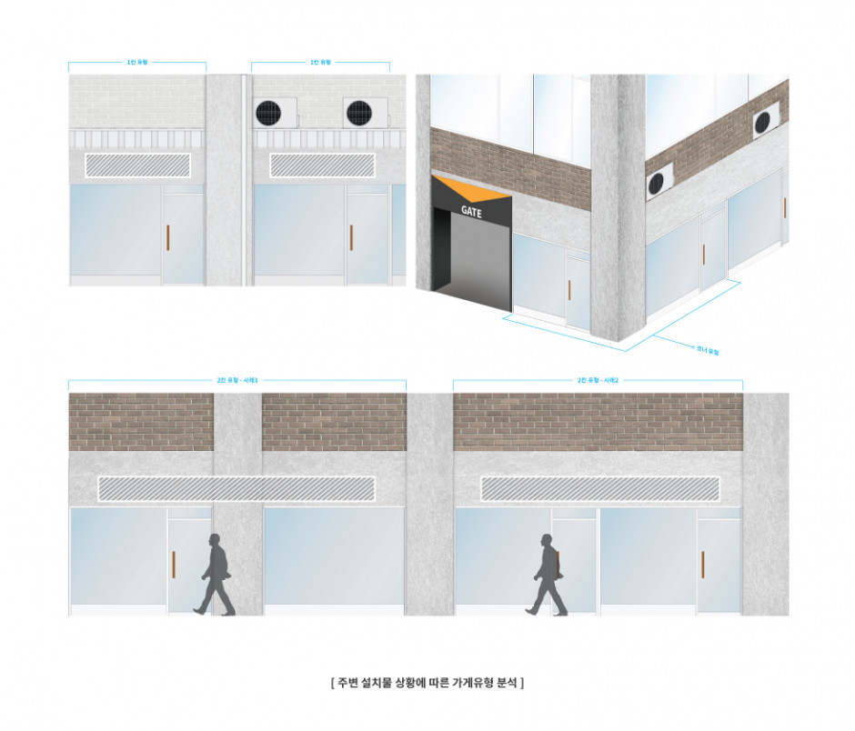
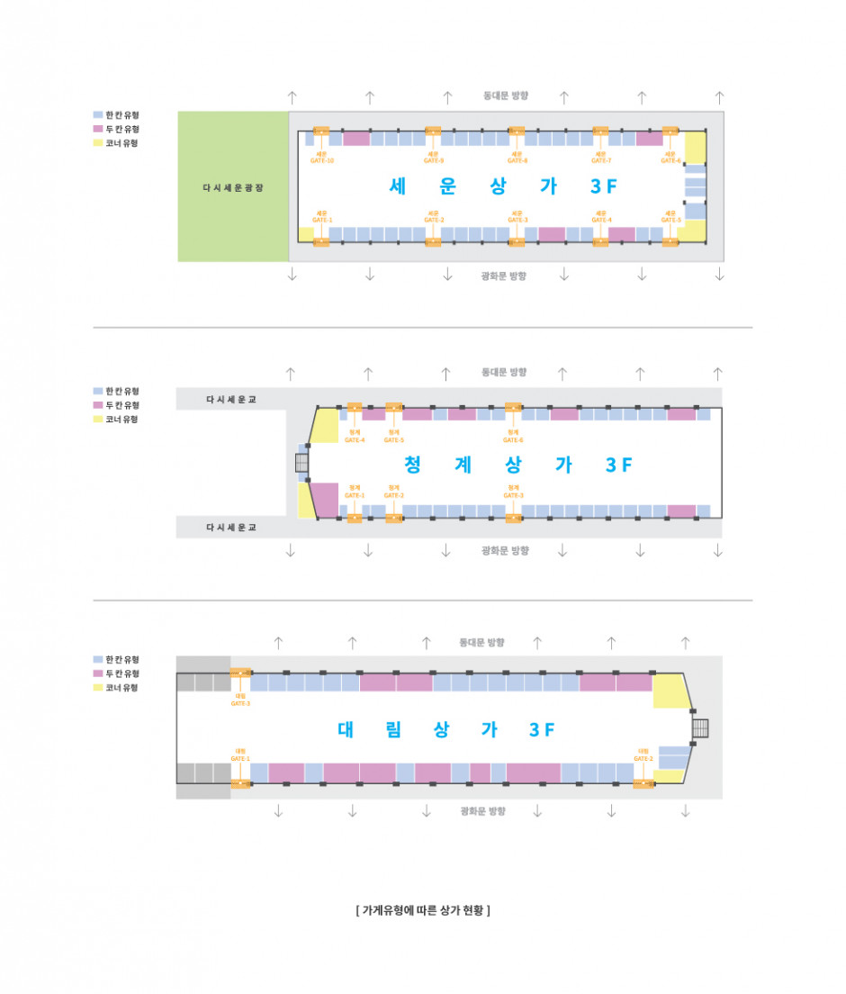
Store typification
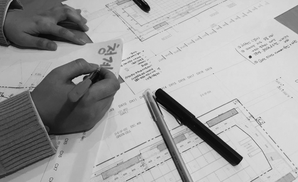
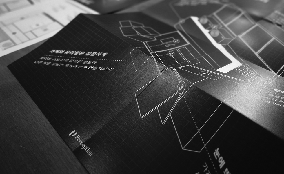
The stores in Sewoon Shopping Street were regularly arranged according to the pillars and sectioning that was already in place in the building. For example, stores could be split to occupy just one "cell" or multiple depending on the size. However, large stores often faced difficulty regarding signage due to the fact that the sign might be split across a column. This created inconsistencies that needed to be addressed. Therefore, as a solution, this project analyzed and deduced three different store types.
Finding the right facade to match Sewoon
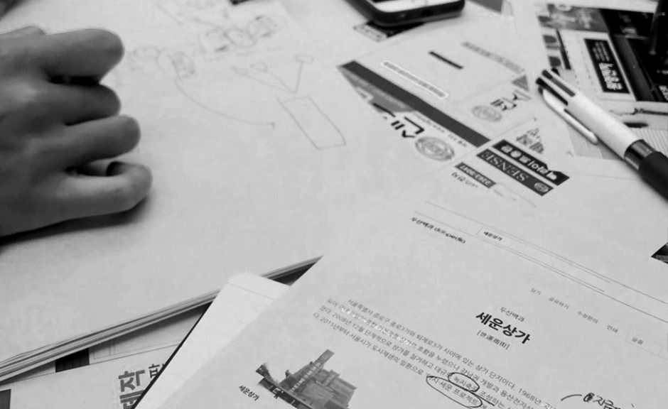
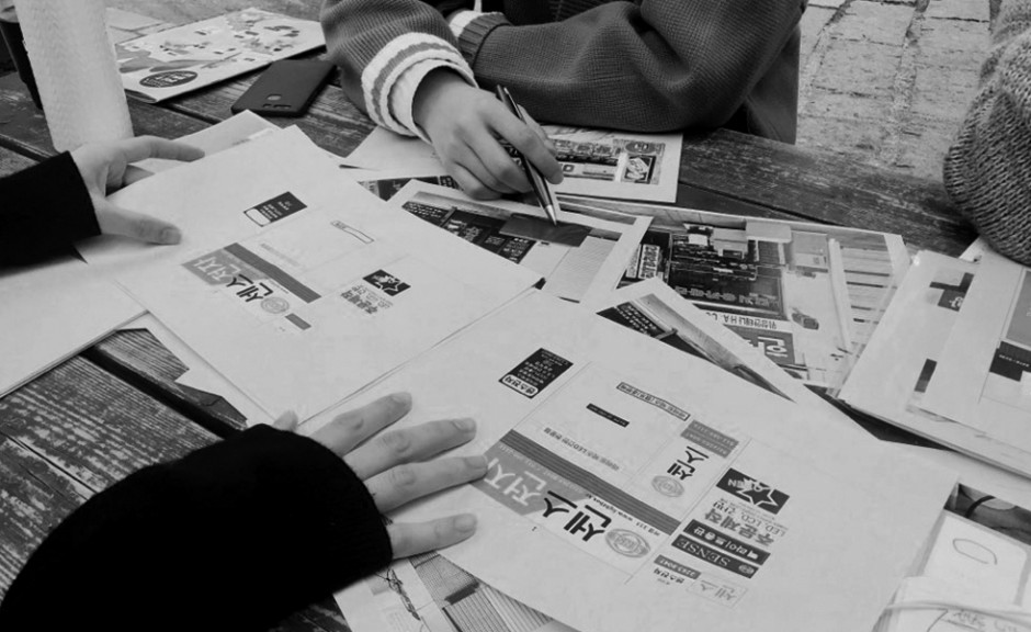
We simulated signage samples that emphasized the unique characteristics of the commercial district as well as collected various references and layouts that could match the entire building. During this process, conducted meetings with business leaders to gain their opinion on the utilization of this guidebook. Throughout this design process, we focused on creating signboard examples that were easier to understand and easy to use for the merchants of Sewoon's commercial district.
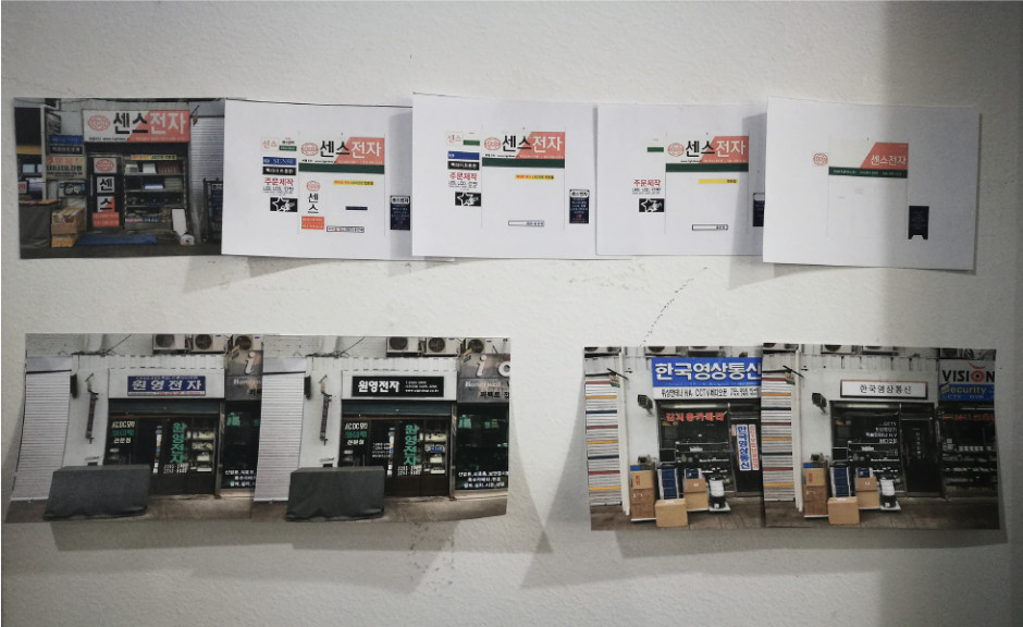
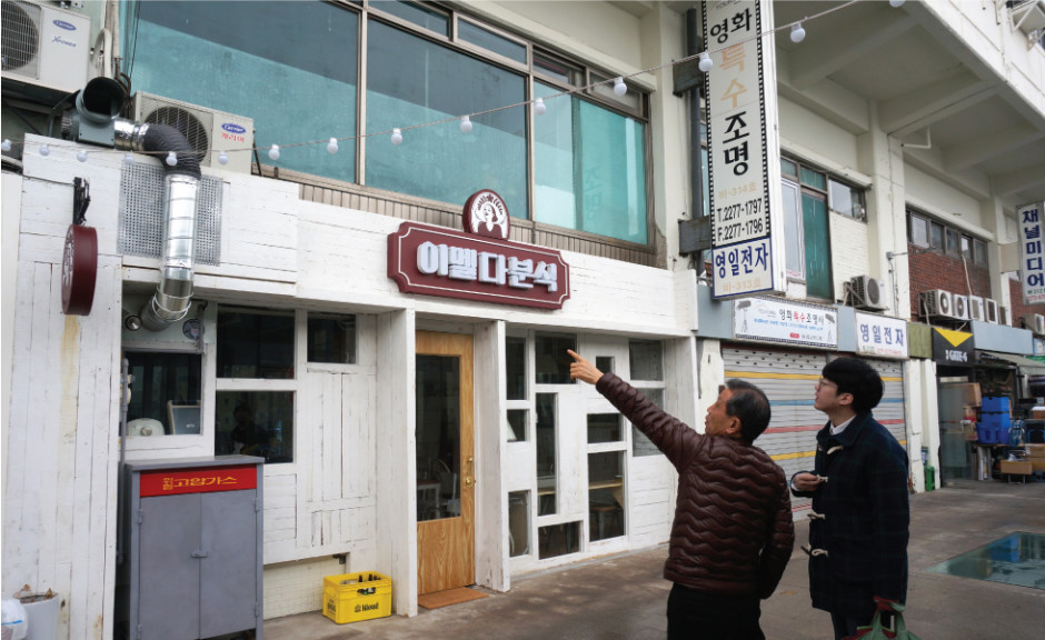
Field research, resident surveying, and analysis at Sewoon Sangga district
Anyone can easily understand the guidebook
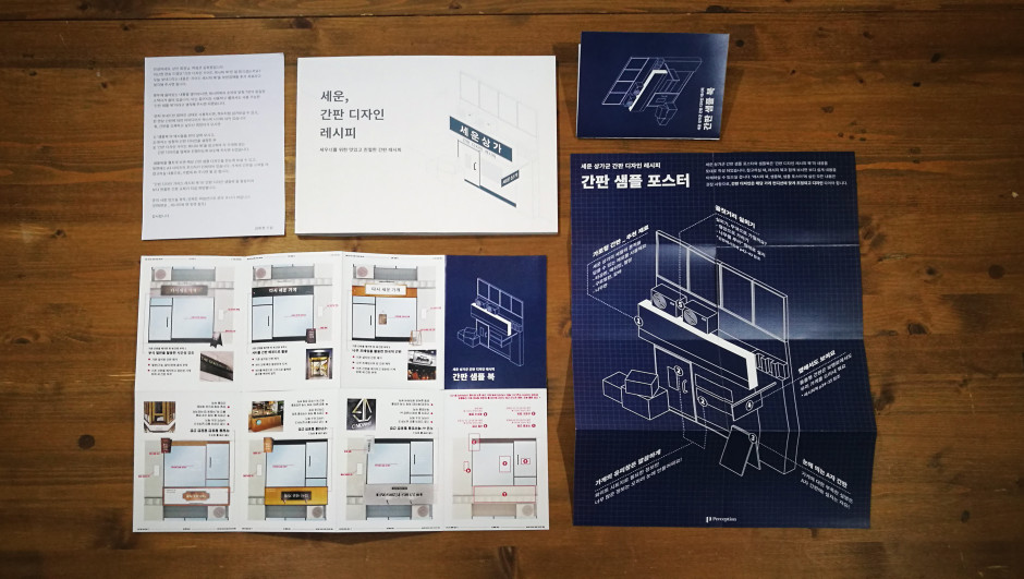
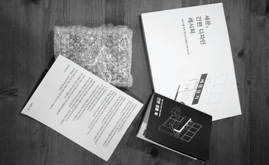
The guidebook gained inspiration from a cookbook. In the same way, someone who is unfamiliar with cooking can make a meal using a cookbook, this guidebook intended to help those who are unfamiliar with signage design, to be able to create a design intuitive sign. In the guide, materials are described as well as how they are transformed and then utilized.
Other topics such as types of signs (main sign, protruding sign, window sign, doorplate, etc.) and step by step guides to the intricate innerworkings are discussed. Also, the use of reference images further help the reader of the guide.
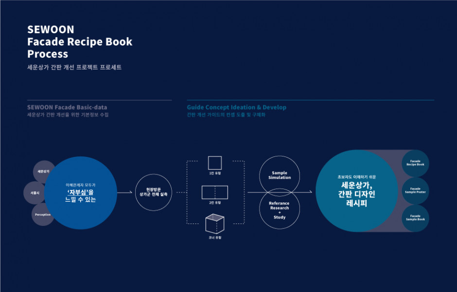

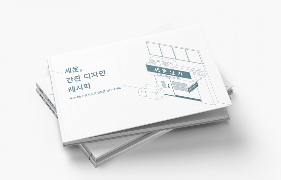
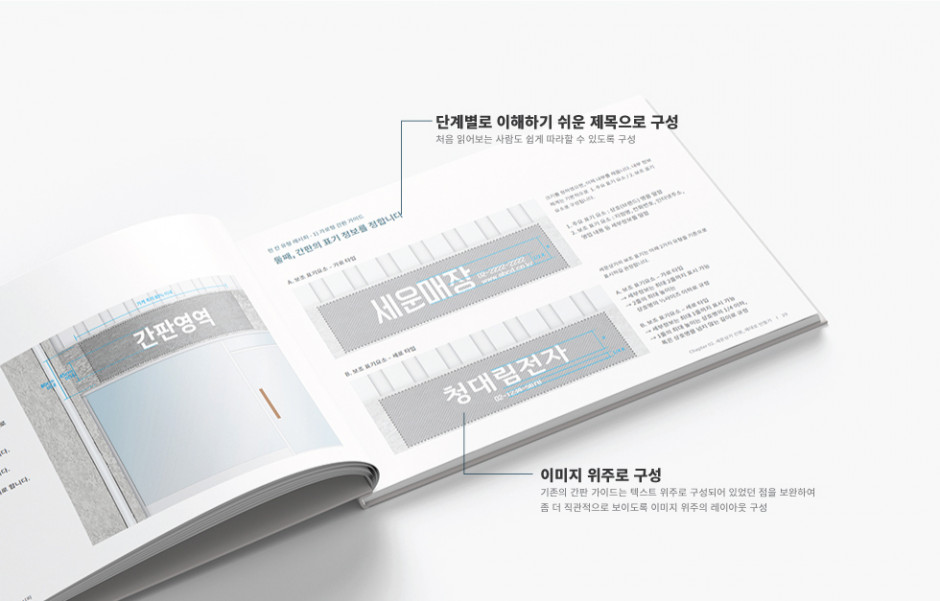
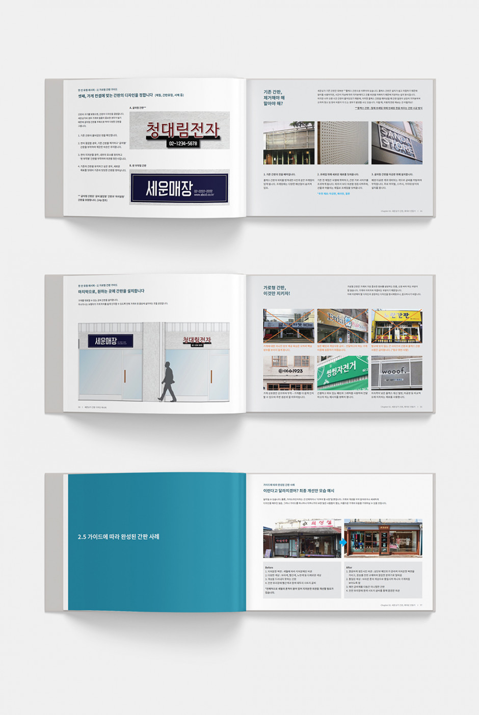
Composition of Sewoon Sangga Signboard Guide Recipe
A guidebook and poster that can fit in the palm of your hand
At times, the size limitations of books can put restrictions on the transference of content. Instead of simply viewing the necessary information at one glance, an individual would need to flip through the pages of a book. Therefore, a poster was created - that conveniently folds to fit inside the book - that gives viewers an easy reference guide to the principles found in the guidebook.
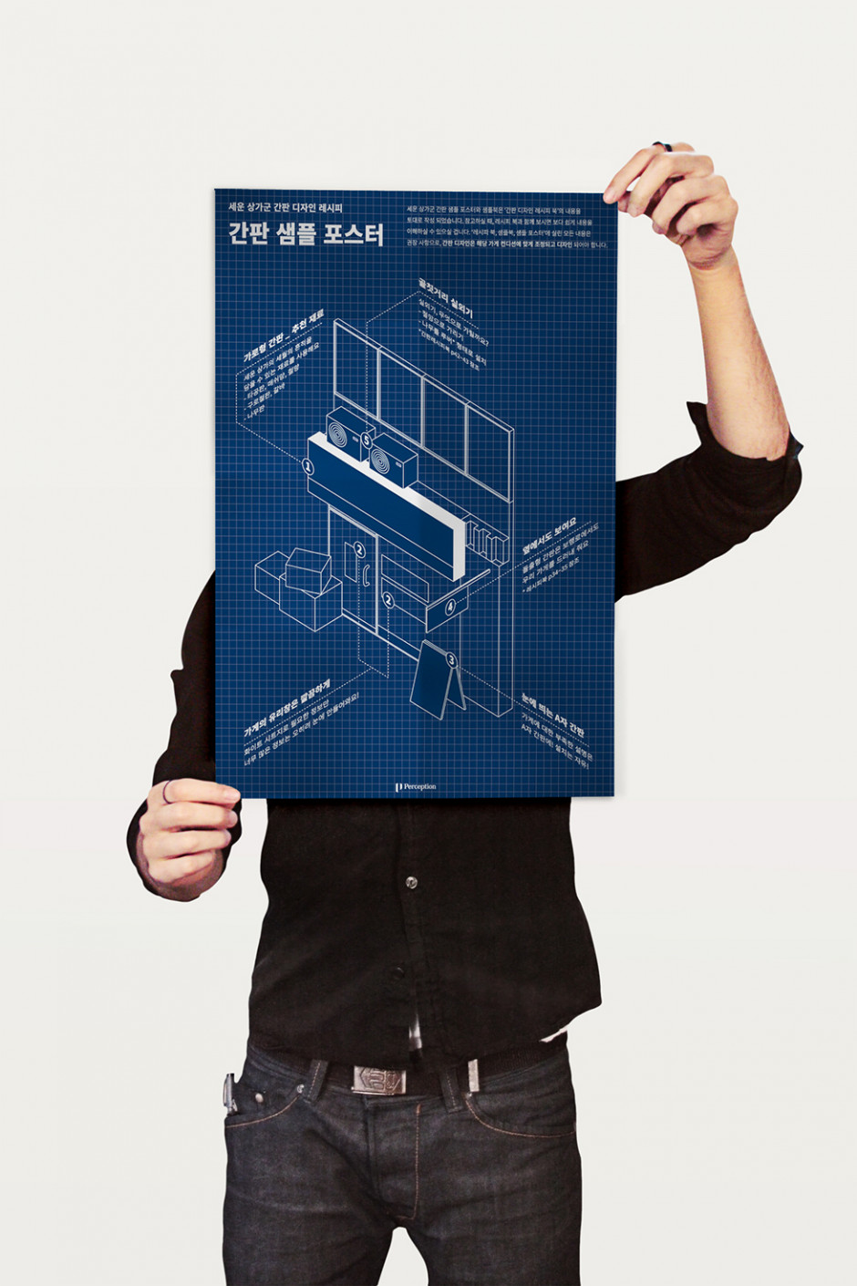
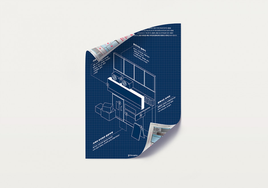

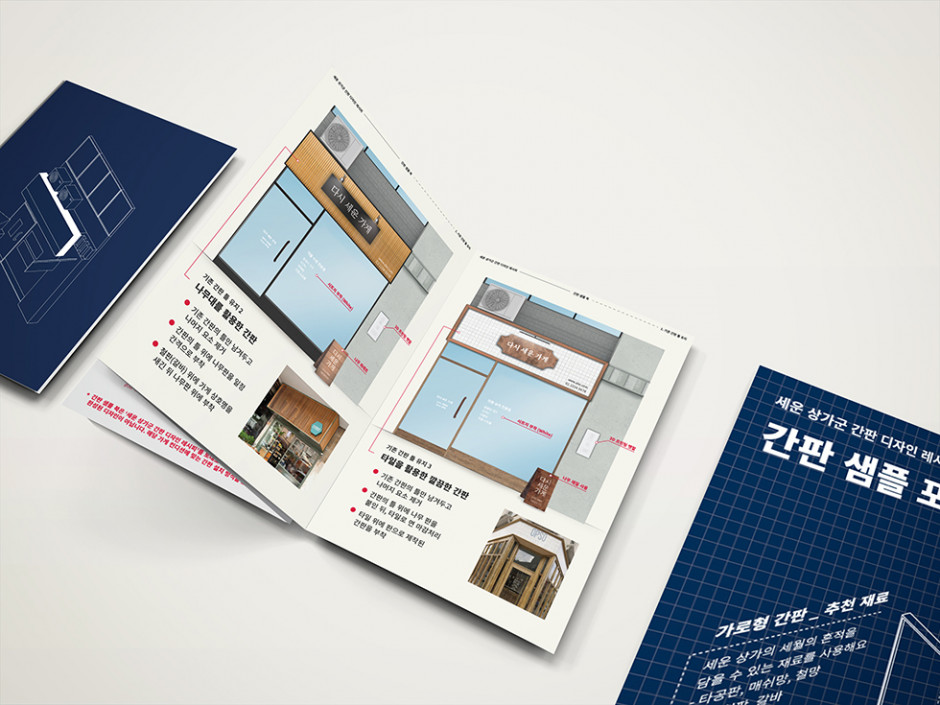
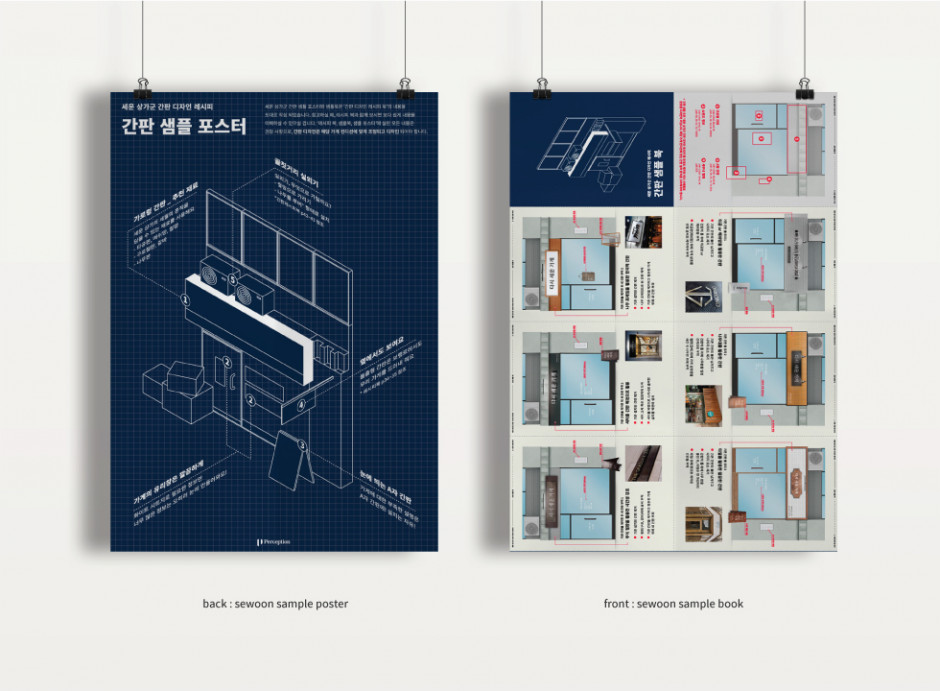
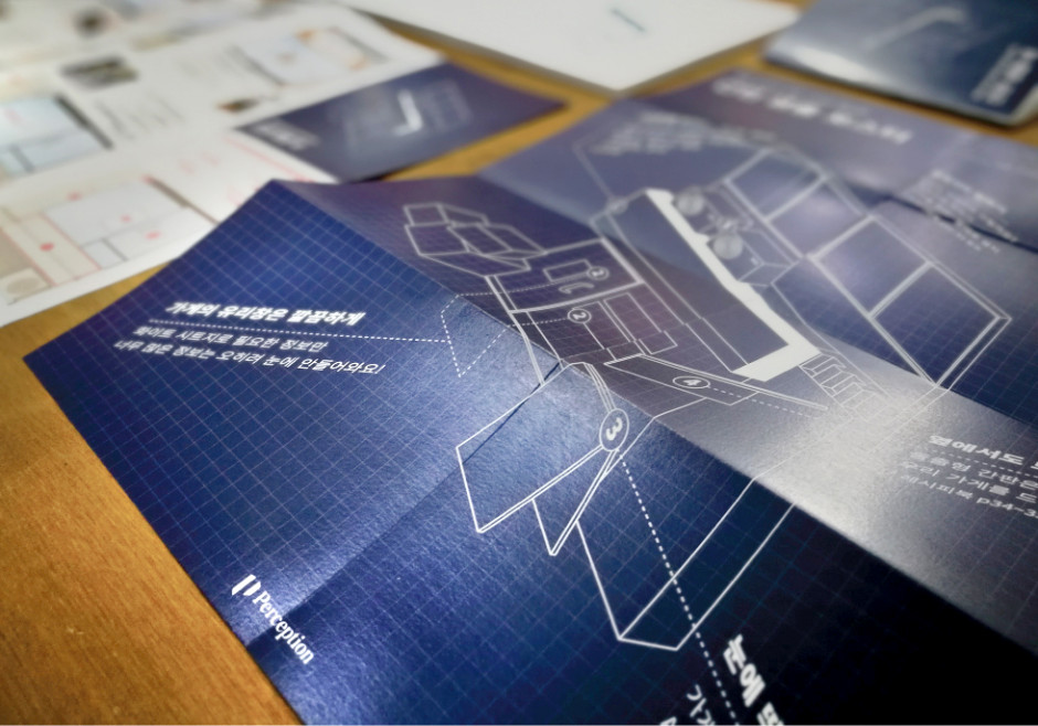
Sewoon Sangga Signboard Guide sample poster
Client
세운·청계·대림상가 상인회
Design
Contents Plan – Perception
Editorial Design – Perception
Poster Design – Perception
Graphic Design – Perception

