
“We’re building not just a guest house or a complex cultural space, but a completely unique and creative space, which is Playce Camp Jeju.”
How did you establish Playce Camp Jeju’s identity, with its ability to perform all of its complex functions?
Many staff members, including the previous creative director, already set in place a basic foundation. Perception, then, came in to organize and complete those elements. In addition to the basic accommodation functions, it was important to organize various elements such as activities, festivals, arts, and F&B in a unified way. After much consideration, the concept of “camp” was created with the slogan “Not Just a Hotel.” I hoped that users would feel like they are entering a fun camp where they can experience passion and excitement. The whole identity was centered around a modern, hip, yet down-to-earth local atmosphere. We wanted to create an atmosphere that would blend with whoever came to visit. Now, it seems like this Playce Camp we are building is becoming our own unique realm.
There were two creative directors for this project. Are there any differences between your design elements and the previous director’s elements?
In organizing the brand concept, the BI needed to be unified under one style. In fact, in this process, we even considered redesigning everything. However, the previous creative team implemented elements in architecture, signage, and building facilities, so we decided to expand on those instead. In the end, we created the current BI by trimming a little bit off the existing BI, which only consisted of a wordmark, and adding the image of a magenta house silhouette. We chose not to abandon the wordmark because the font style was very stylish, but we chose to expand on it because the wordmark alone didn't encompass the various applications of the brand.
The magenta color seems to stand out from the natural feeling of Playce Camp and Jeju in general.
The color was originally set as magenta, before we came in. Of course, magenta doesn’t match well with the landscape of Jeju. However, in thinking of other colors as an alternative, we saw that the magenta expresses a unique, unfamiliar feeling that represents a non-daily experience, so we decided to stick with magenta.
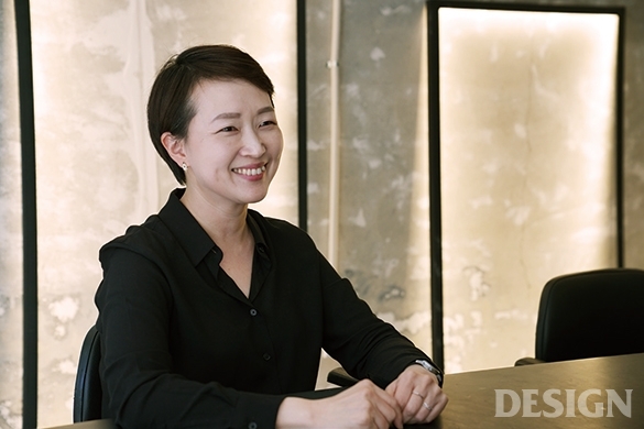
I’m with the current brand experience director for Playce Camp Jeju. In Perception’s thoughts, what is Playce Camp Jeju’s personality?
Before Playce Camp Jeju’s opening, the main customer was expected was centered around a woman in her 20s. However, since its completion and opening, we found that the customers were much more divers. Writers and creators, who often com to Jeju for work; employees working for big or small companies, including startups; young people traveling to Jeju for festivals; and people participating in the nearby market all are customers at Playce Camp Jeju. In that sense, I would describe Playce Camp Jeju as a place where people can regain time for themselves and where they can find the playful attitude that they might have forgotten.
See interview in Korean here: http://mdesign.designhouse.co.kr/article/article_view/101/79159


