Background & Key Issues
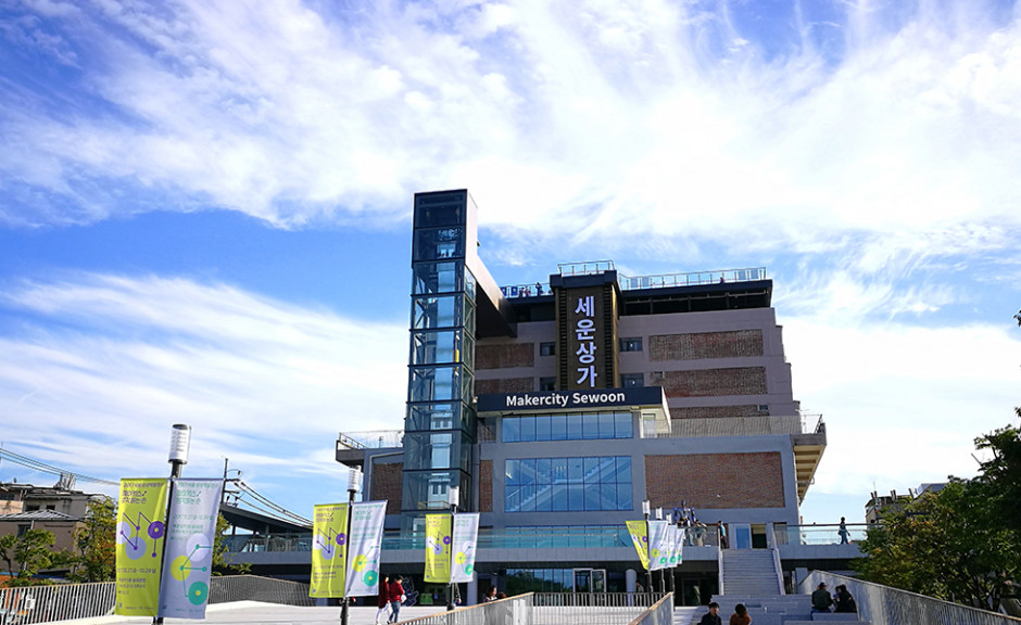
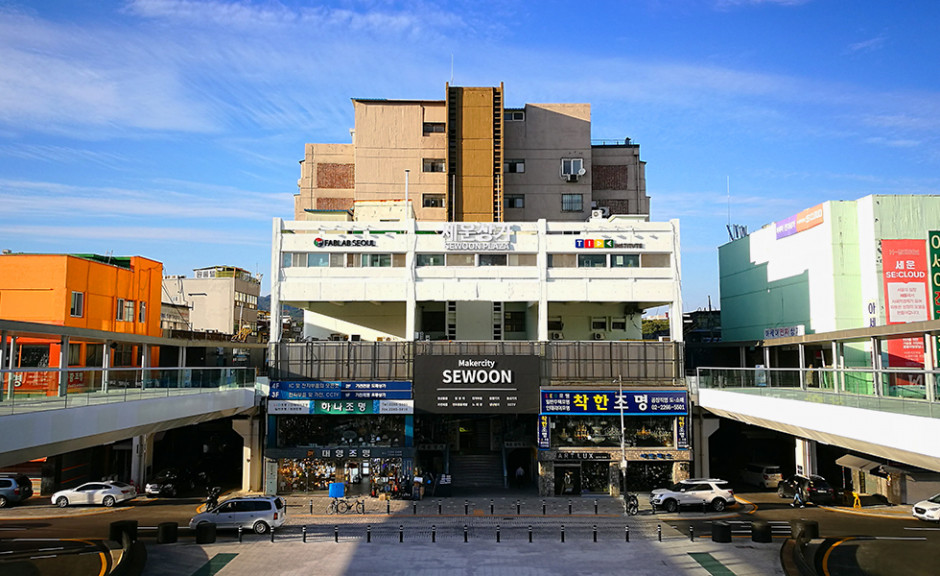
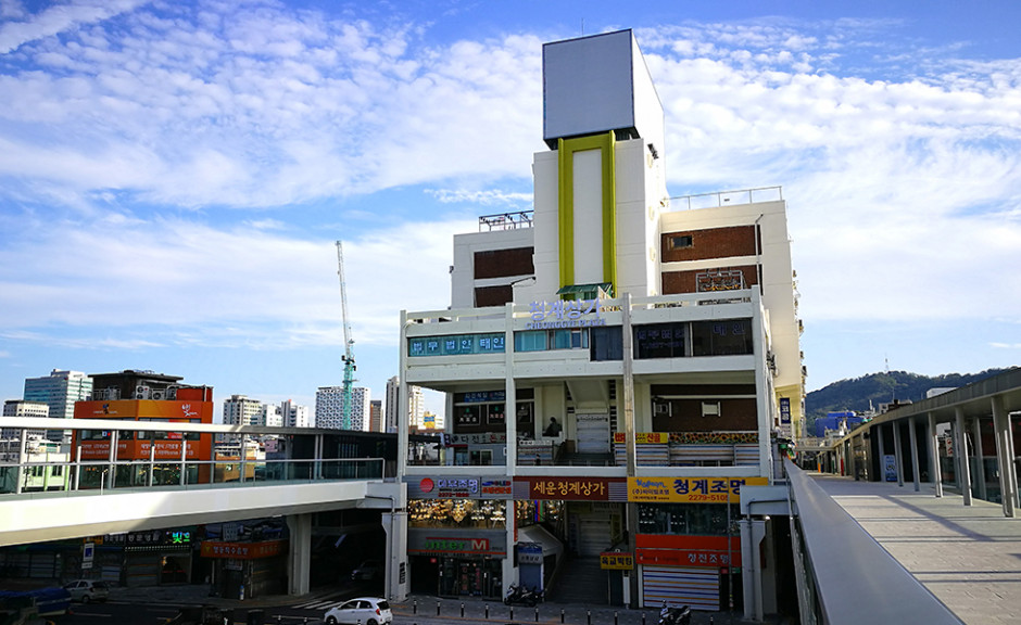
Sewoon Project: Revitalization of the historical building built in 1968
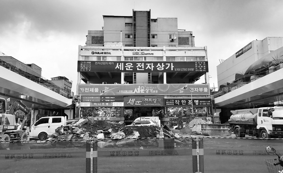
Sewoon Sangga, which was established in 2015 as a design consulting firm, faced an issue of clearing up previously rushed design choices in time for its reopening in 2017. Some examples of this were reckless sign improvements, rushed paintings and murals, and overall designs that lacked unity.
In the end, the main issue was persuading city officials and merchants that cleaning up and subtraction of elements is also excercising informed design.
Approach & Solution
Eliminate and repair messy elements as much as possible
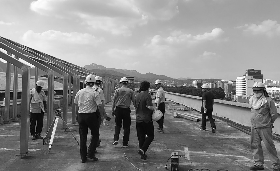
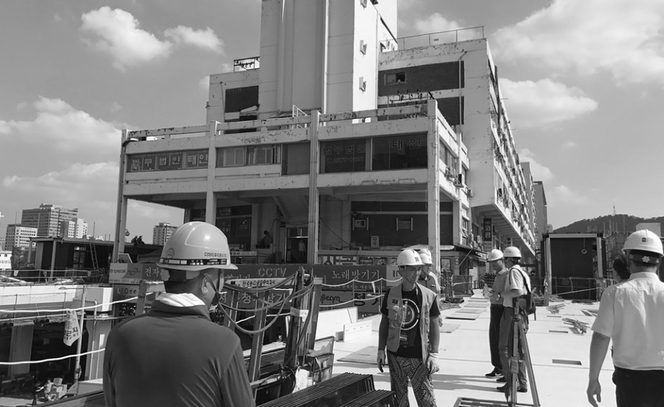
Since there was not enough time or manpower to come up with a completely new design, we focused on simply excluding the designs that did not fit the elements that are prevalent in Sewoon Shopping Street, the surrounding area. On-site visits we crucial in successfully approaching this step.
Before the reopening, 1) hazardous elements needed to be removed, 2) dirty items needed to be changed, and 3) mindless design characteristics needed to be resolved. Then, and only then, could a new approach be addressed. These were all crucial steps considering the building was reopening under the promise of a new facade.
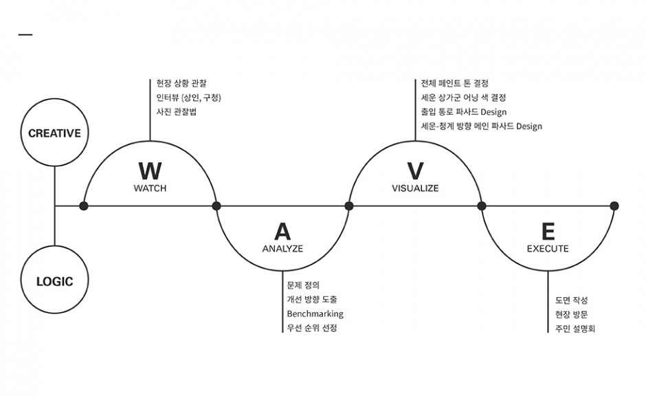
Establishing a systematic strategy using P-Wave
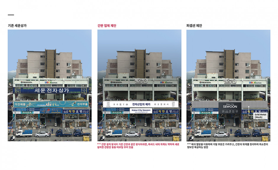
Analyze signage systems and modify as appropriate
Repetitive elements are removed and the necessary elements are organized
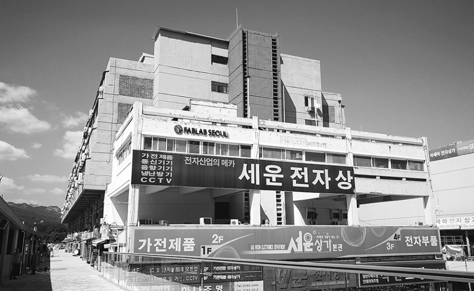
The key project element was removing things from the facade of the building that had no clear meaning or purpose. Additionally, the paint color of the building was chosen as similarly as possible to the existing paint. Areas that posed potential threats to pedestrians were repaired. Any repetitive signs were consolidated into single signs.
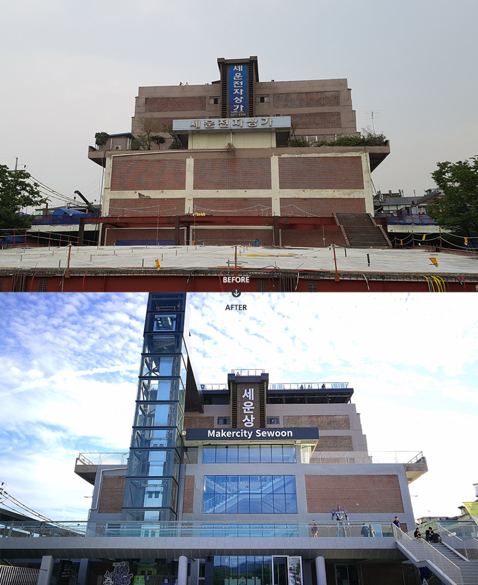
It was important to remove the ill-matching paint from the previous redesign and create a harmonious color scheme, which was also reminiscent of the original architecture.
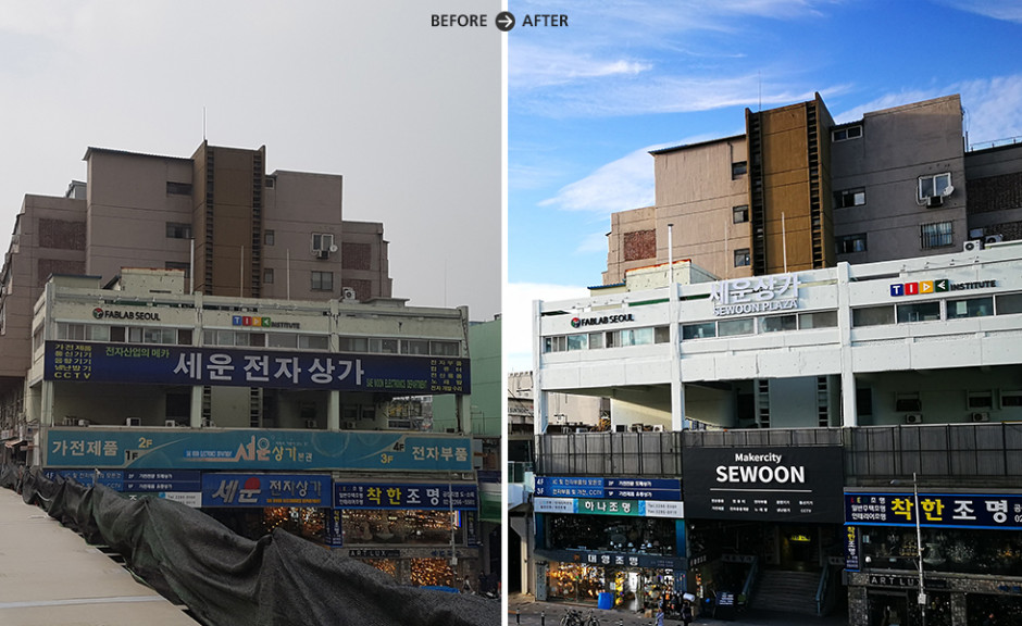
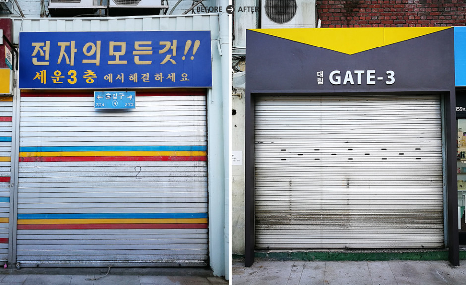
Signage referring to the Sewoon Shopping Street appeared three times in the previous design's facade. This project saw that that information was consolidated into one sign.
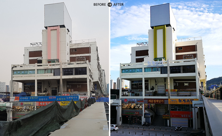
The peeled and torn paint was not only unsightly, but it also posed a potential danger to pedestrians. The main color was maintained during the repaint process, while an accent color was chosen to maintain the overall color scheme of the building and its surroundings.
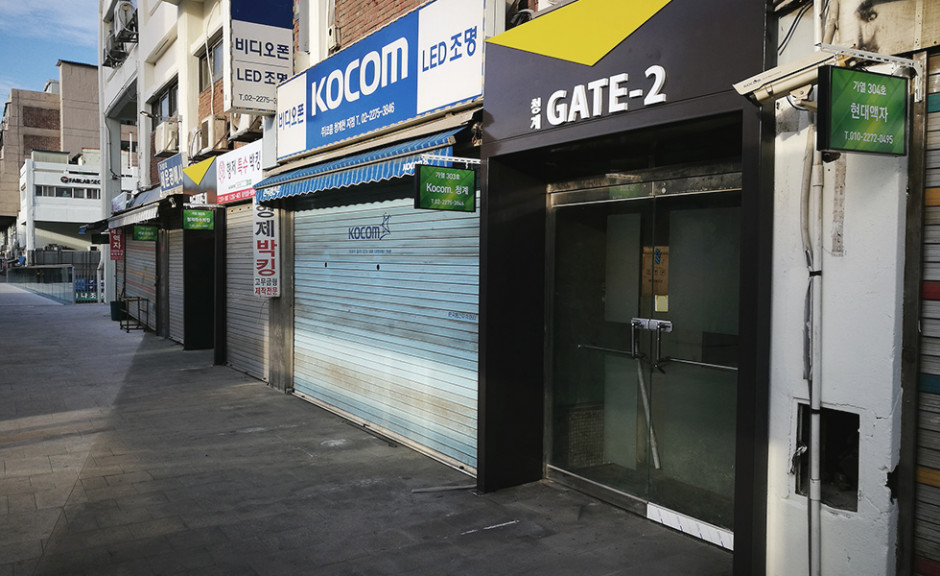
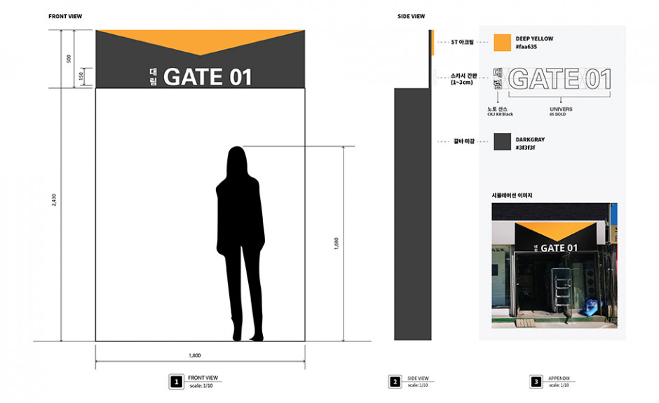
Access points which were previously unrecognizable, were given a redesign, which drew attention and increased readability.
Client
서울시 역사도심재생과
Design
Design Consulting - Perception

