Summary
Reinterpreting Olive Young's vision and
mission through Space Identity and developing corresponding concepts and
touchpoint to effectively implement a new shopping experience.
Background & Key Issues
Development of Olive Young Space Identity and Design for the New Shopping Experience.
Design a space for a "joyful" and "easy to buy" shopping experience that is consistent with Olive Young's current brand experience.
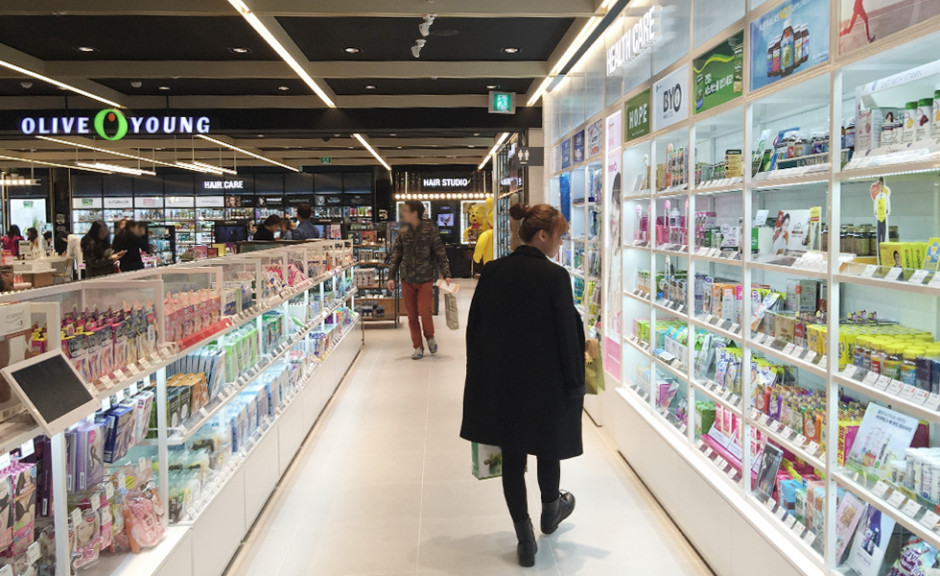
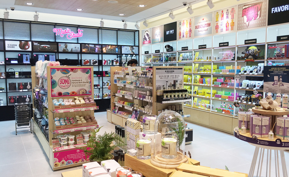
Olive Young is Korea's leading health and beauty brand, offering a wide selection of products for customers to choose from. The Myeongdong location is the flagship store where you can experience the latest trends in Korean Health & Beauty, and that location is loved by foreign tourists and Korean consumers alike. This project aimed to develop space design and VMD that reimagined this Myeongdong, two-story location.
The second floor offered different kinds of merchandise in one place including body, hair, food, and living goods. The aim was to combine all of the various types of products into an overall brand experience called "Olive Young." Meanwhile, while there were many experience spaces on the second floor, due to the sites role as the flagship store, the services were not adequately able to translate to increased sales.
The key issue was to develop a design strategy that would enable consumers to simultaneously experience the Olive Young Brand as well as the various products and individual brands being sold within Olive Young. Then, these experiences should link directly to revenue. Above all, the space, being the flagship store, e should be highly representative of Olive Young's identity as well as the state of Korean Health & Beauty.
Approach & Solution
Definition of Spatial Identity in Olive Young's Myeongdong flagship
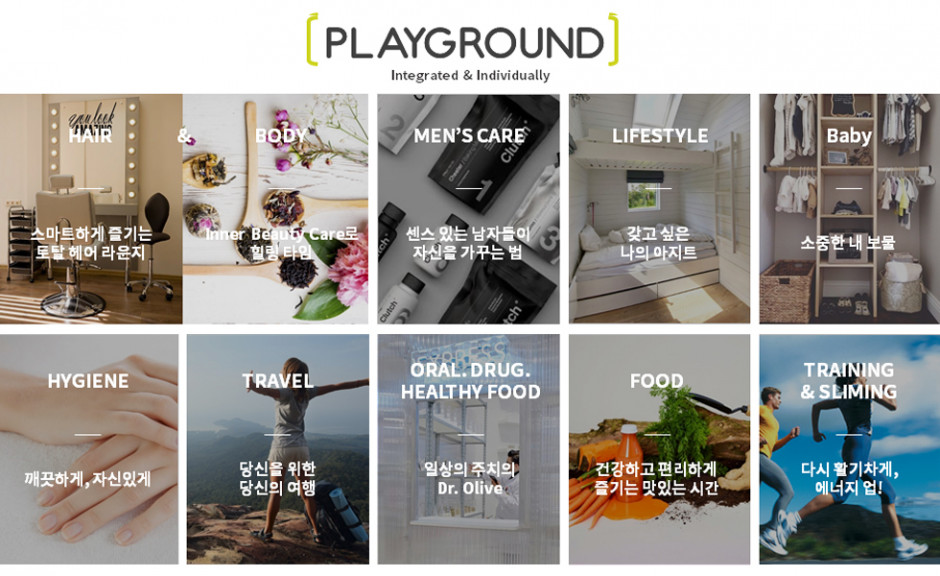
Approach: "Playground" concept: Creating a happy experience of products that can my my daily life trendy
Olive Young is a brand that aims to provide differentiated products to shoppers under the vision of "The Playground of Trend Leading Shoppers." Based on this foundation, the concept of a "Playground" was used throughout the space design of this store.
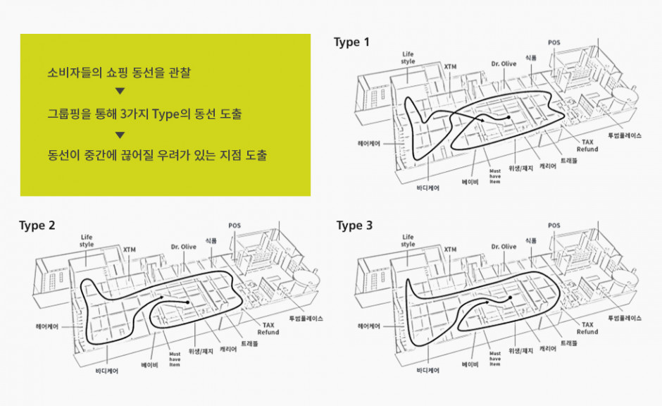
Observations and surveys identifying current problems.
Customer loss due to inefficient product mapping of customer flow per zone.
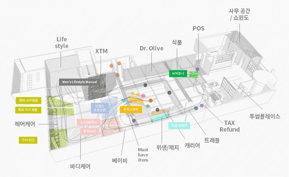
The second floor of the Olive Young store consisted of more than 10 zones covering different product categories. Some zones, which were located in remote areas, were inevitably visited a fewer customers, and this was reflected in decreased sales of the products in those areas. Additionally, it was found through on sight observation that customers who had trouble looking for products or finding the appropriate zone were less likely to make a purchase and shopped for considerable less time overall.
Development of zone-specific concepts and experiential spaces to stimulate unmet needs.
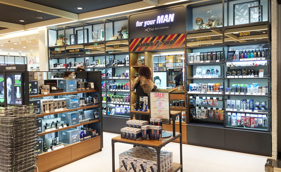
Myeongdong Flagship introduces a concept of exploration and fun with each individual zone.
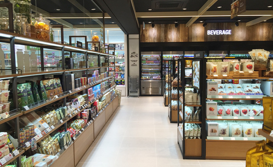
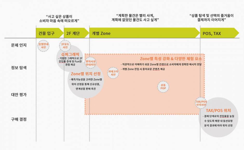
To make it easy to remember which zone sells which product, the products have been carefully organized into logical categories that are then assigned to each zone. While providing a simple pleasure of walking around and exploring the store, we made it easy for consumers to find the products they wanted. We also developed various experience elements throughout the store that touch on all five senses. In particular, we have added visual aides to identify points of purchase (POP) throughout the space.
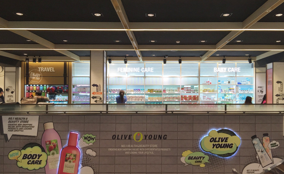
Travel/Feminine Care/Baby Care Zone
Designing a customer flow to navigate through the store with the destination reaching the payment phase.
The design of the shopping route is based on customer psychology, and attracts visitors to all areas of the store.
Early on in the project, observations found that customers were not walking into areas of the store in which they could not easily predict was being sold there. Due to the nature of the second floor as selling a wide array of products, this phenomenon was especially noticeable there. To give customers a greater sense of what product is in which zone, zones dealing with similar products were placed adjacent to one another and, therefore customers could travel further into different zones with certainty.
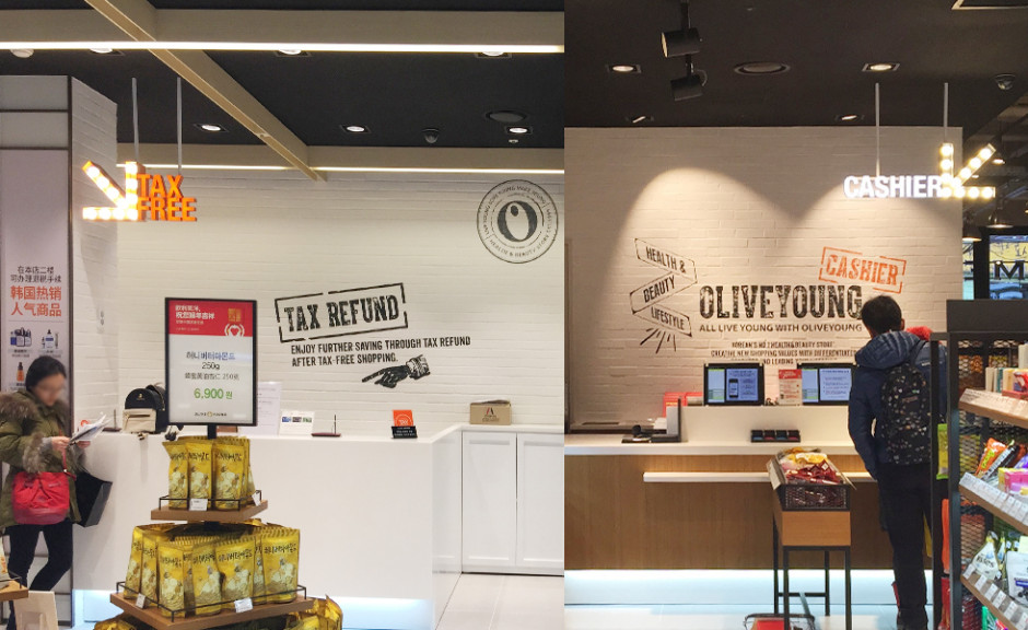
Improved signage systems
Intuitive, easy to understand designs for customers seeking for the cashier, tax free desk, etc.
Customers who get lost and therefore experience delays in shopping are less likely to enter the payment phase. By developing eye catching signs that address these issues, we were able to smooth out any customer ambiguity.
Category
Experience Design
- Space Identity
- Communication Design
Main Task
Space Design
Signage System
VMD
Process & Methodology
Research>Planning>Design>Construction Documents
Watching
Interview
Market Research
Customer Journey Map
Design
Space Programing - OLIVE YOUNG, Perception
Space Design - Perception
VMD Planning & Design - OLIVE YOUNG, Perception
Design & VMD Direction - Perception
Graphic Design - Perception
Signage - Perception
Construction
Construction - DesignEnergy


