Summary
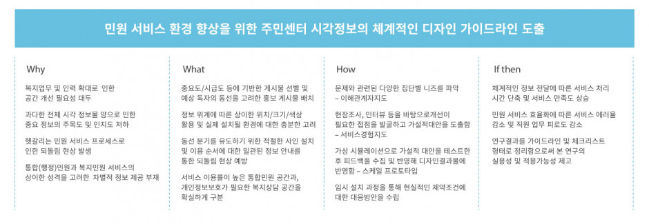
- Identify hidden problems in the proccess of providing public servicces to the community center and suggest solutions
- Improve the quality of public service provisions in the future by setting this examples as a point of reference.
Background & Key Issues
Development of Visual Information Design Guidelines for the Community Service Center
Seeking to improve the quality of the overall civil service experience by combining welfare civil service personnel and services in a limited space.
The Community Service Center is an integrated service center that provides customized services for residents including welfare, culture, employment, and physical education. The work of the community center was largely done by the "administrative team" in charge of the integrated civil service and the "welfare team" in charge of welfare counseling. However, due to the expansion of welfare policies in 2015, it was necessary to accommodate the growing number of employees and services.
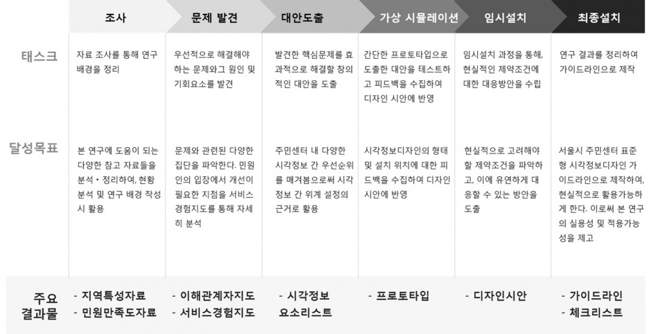
Process & Methodology
Approach & Solution
Issue 1: Confusing promotional materials that obscure crucial information
Approach: Selection of posts according
to importance, release, and/or announcement period and placement of promotional
posts in consideration of expected readers' movements
According to on-site surveys, most community center bulletin boards are covered with various postings of content with unclear meaning. This clutter made it even more difficult to receive the important messages that was dispersed within these bulletin boards. The approach was, therefore, to prioritize the content based primarily on criticality and time-to-market rates. Additionally, the Center wanted to move the postings to a location that wouldn't interrupt the flow of the visitor's movements throughout the space.
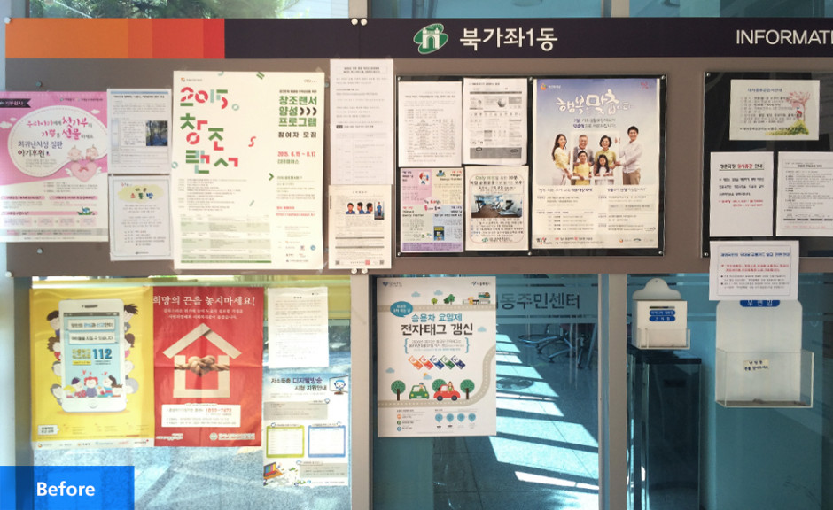
Posts without organizational techniques (Bukgajwa 1-dong Community Service Center)
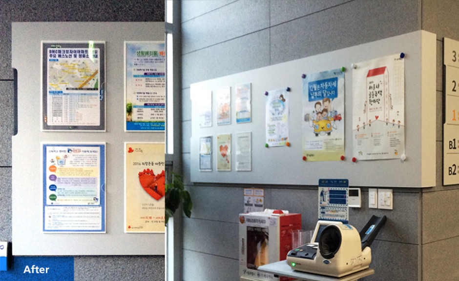
A bulletin board installed in an unobstructing location with clear information hierarchy (Namgajwa 1-dong Community Service Center)
Issue 2: Service Flow confusion due to low visibility of key information
Approach: Use of different locations,
size, and/or color depending on information hierarchy and installation
environment
As a result of field surveys, we found that it was difficult to utilize services in community centers because descriptive information was not readily available. To address this, we first identified various priorities and hierarchies between different pieces of information through grouping. Based on this different typographical sizing and colors were assigned to different information so that information could be easily digested. Additionally, the Center wanted to apply the appropriate locational placing of the information as it referred to the available services.
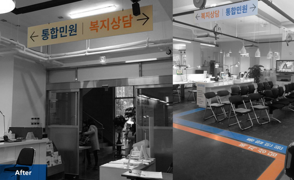
Sign installation location and color are applied differently based on the type of information and hierarchy (Namgajwa 1-dong Community Service Center)
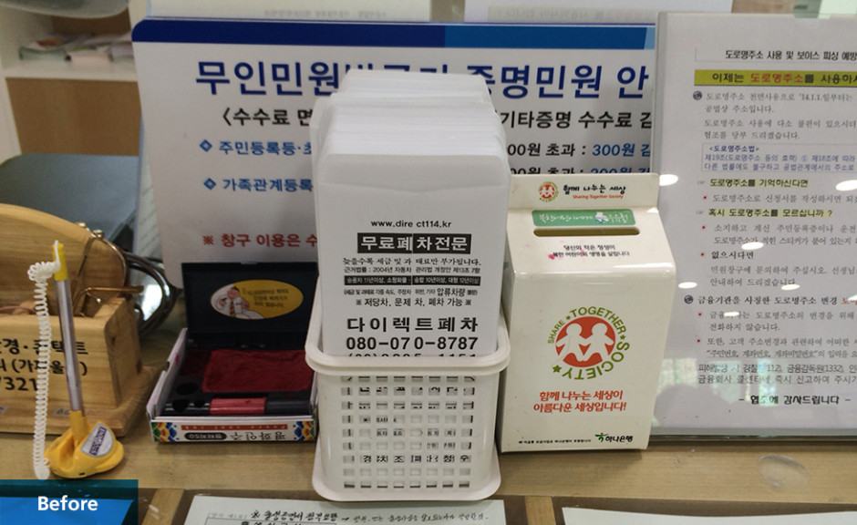
Non-critical items blocked the smooth delivery of important signage (Bukgajwa 1-dong Community Service Center)
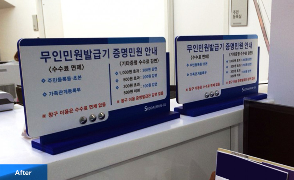
Information is now accessible with a quick glance (Namgajwa 1-dong Community Service Center)
Issue 3: Inefficient service flow due to improper placement and unsatisfactory signage
Approach: Provide proper sign installation and consistent information on the sequence of use for the center functions
With the expansion of the welfare services, many of the functions that were once carried out by center employees were being replaced by machines. However, through an observation survey, we found the actual utilization rate to be quite low. Accordingly, the Commission decided to install Automated Civil Engagement Machines (무인민원발급기) near the entrance of the Community Center and the entrance to the Civil Service Office as well as provide devices that facilitate recognition and utilization of the machine.
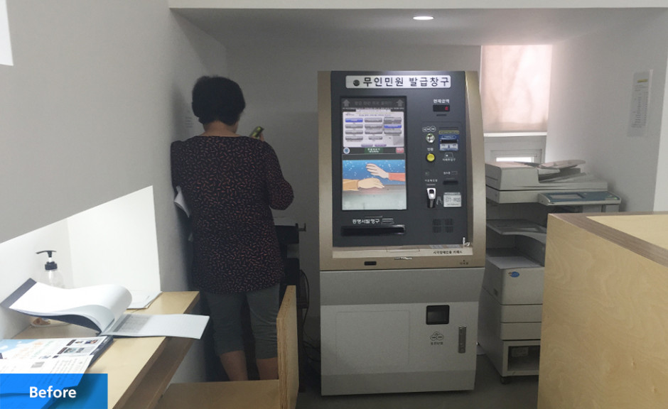
The Automated Civil Engagement Machine's poor location in the inner corner of the Civil Service Office was the reason for its low utilization rate (Siheung 5-dong Community Service Center)
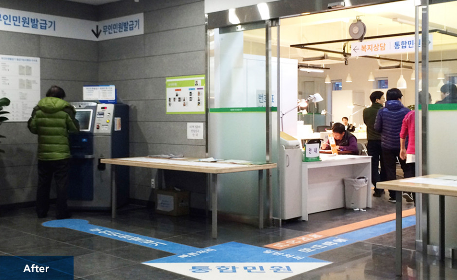
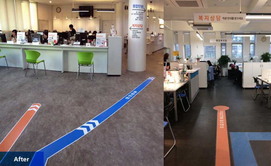
Integrated access to civil service machines and functions, reducing the burden on the users (Namgajwa 1-dong Community Service Center)
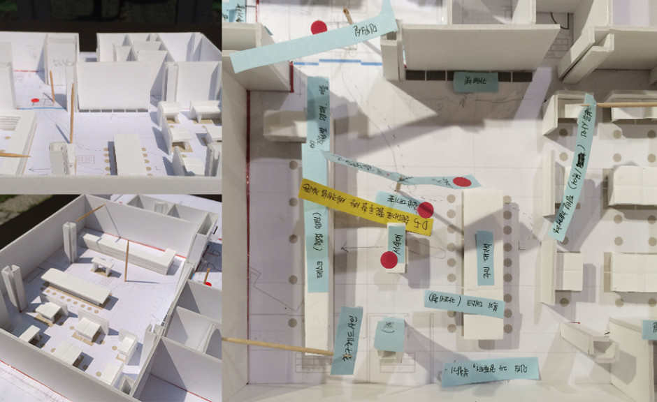
Gathering feedback and testing hypothetical alternatives through mockups
Although different service procedures were required for each type of civil service (integrated civil service, welfare service, etc.) there was no continuous information guide, which often caused confusion or delays at each stage. To solve this, information about the services was posted at the entrance to the community center as well as in key places throughout the facility.
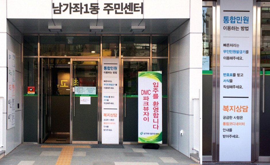
A service map is installed at the entrance of the center to reduce visitor congestion (Namgajwa 1-dong Community Service Center)
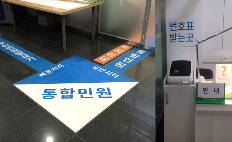
Increasing the visitor's awareness of key functions, such as the Automated Civil Engagement Machine, before and after entering the Civil Service Office (Namgajwa 1-dong Community Service Center)
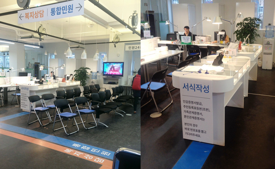
Colored lines on the floor indicated the proper pathway depending on what type of service was necessary for the visitor (Namgajwa 1-dong Community Service Center)
Issue 4: Lack of proper information distinguishing integrated civil service offerings and welfare counseling services
Approach: The creation of defined spaces based on the visitor's purpose of visit as well as introduction of necessary elements such as client privacy
One of the problems found during field investigation was that there was no clear distinction between the integrated civil service offerings and the welfare counseling space, which could expose the consultation content and personal information of the visitors who are receiving the counseling. In order to ease visitors' anxierty about these privacy breaches and deliver a comfortable service experience we have proposed a strategy of zoning the welfare counseling space away from the integrated civil service space. This also allows for smoother action catered to the needs of the visitor.
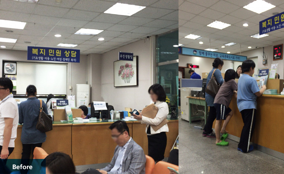
The welfare counseling section located near the waiting area within the office left a high possibility for the exposure of sensitive information (Ahyeon-dong Community Service Center)
New organization clearly separates the two functions and ensures the protection of counseling contents (Ahyeon-dong Community Service Center)
Issue 5: Absence of design guidelines that are practically applicable
Approach: Develop design guides and
checklists that are easy to use throughout the Community Service Center system
The Visual Information Design Guidebook was created to serve as a practical guide and checklist for Community Center staff. It provides practical explanation for the installment of intuitive space design as well as management of visual information. The guide also makes special note on the maintenance of these systems after the installment completion.
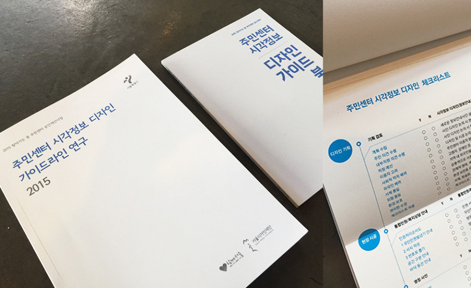
Three checklists were provided on the subjects of design planning, on-site construction, and maintenance making it easy to follow for community staff and managers
Category
Experience Design - Communication Design
Main Task
Field Research
A study on the current status of Community Service Centers for the purpose of enhanced efficiency
Pilot application
Review design criteria and apply design demonstration
Design guidelines
Development of guidelines for future projects on improving community centers
Final Deliverables
Research Report
Design Guide Book(Design Guideline, Checklists included)
본 프로젝트는 (재)서울디자인재단 서울디자인연구소 시민디자인연구센터의 '2015 동 주민센터 시각정보 디자인 가이드라인 연구'로서 진행되었습니다.

