Background & Key Issues
Himart's new high-end service, Himart Premium
Himart, which has previously led the consumer electronics market with affordable prices, accessibility, and product diversity, recently began to face challenges with the growth of online distribution. Under these circumstances, Himart sought to increase their distribution channels and customer contacts through a premium brand experience. This project, therefore, needed to develop naming strategy, concept, and design that offered elevated brand values when compared to the traditional Himart.
Approach & Solution
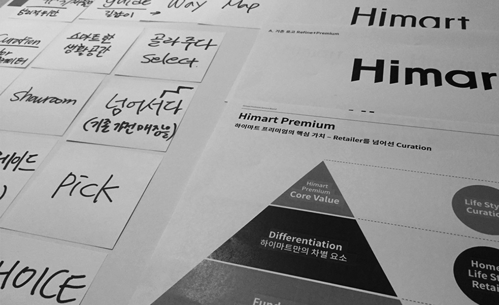
Prior to the development of the premium brand, the future direction for Himart-Way was first discussed. Using that as a baseline, plans for experiences and services beyond the normal home appliance store were created. Target customers were defined, then service contacts were drawn using customer journey maps.
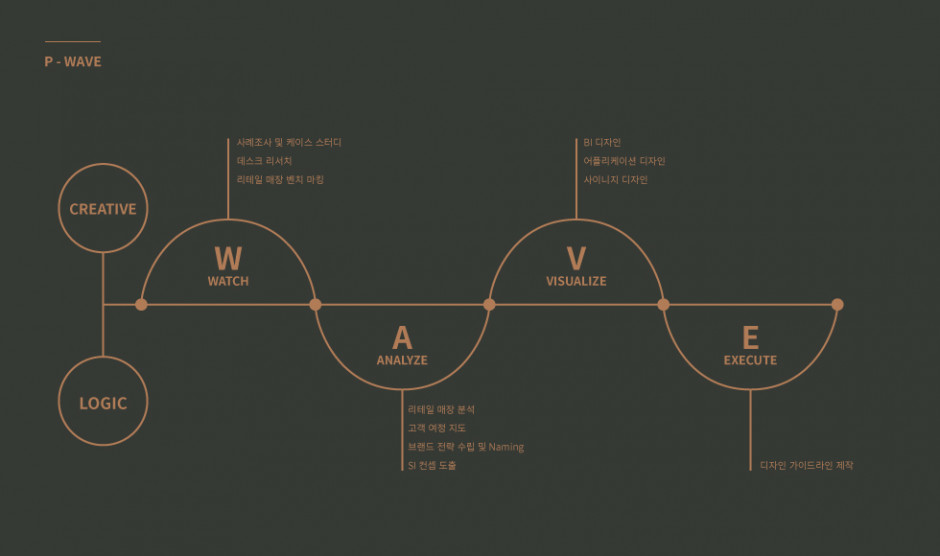
Establishing and overall strategy using P-WAVE
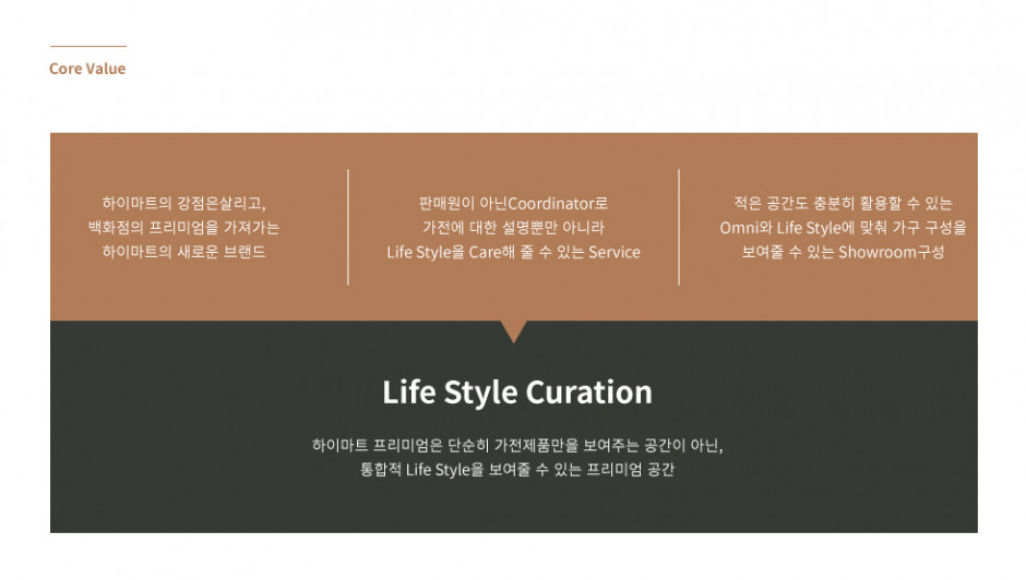
Through analysis, it was determined that the core value that only the HImart Premium can offer is that of "Lifestyle Curation".
Visual Communication Theme & BI Design
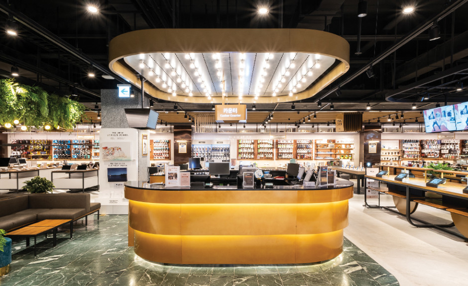
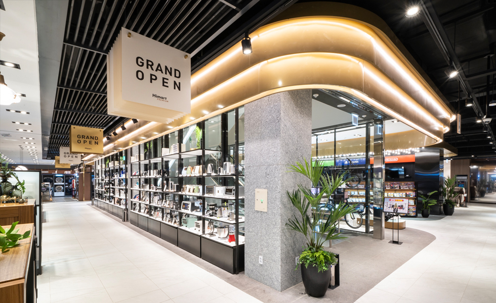
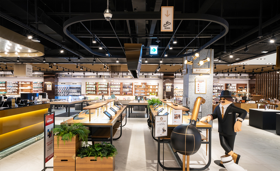
Serving as a place to deliver differentiated brand value to customers as well as place to shop in peace, Himart Premium used a visual communication strategy centered around the theme of a "Salon de Noble." The stores would stock premium home appliances and luxurious lounging arrangements were to be placed in the center of the shopping areas to provide a comfortable mood.

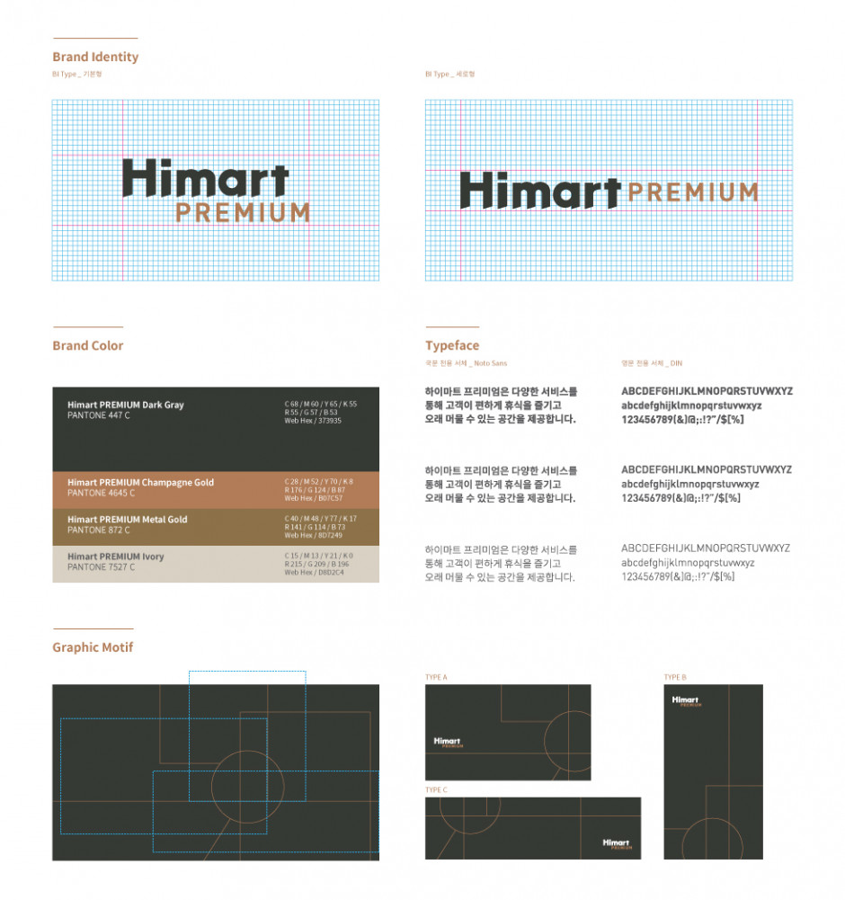
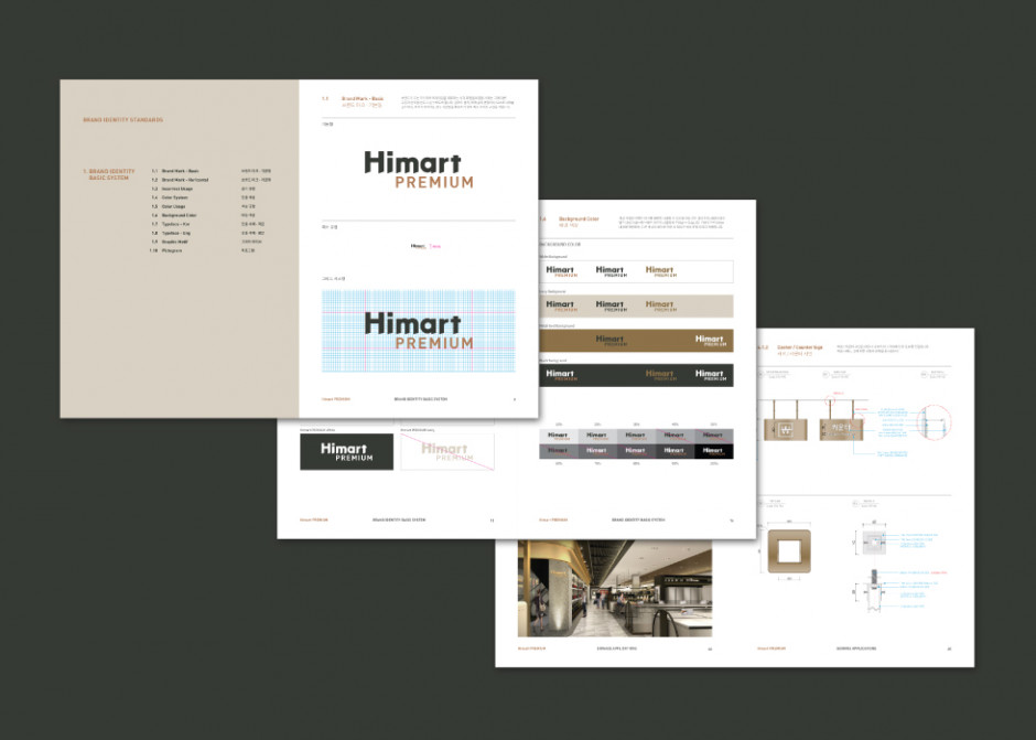
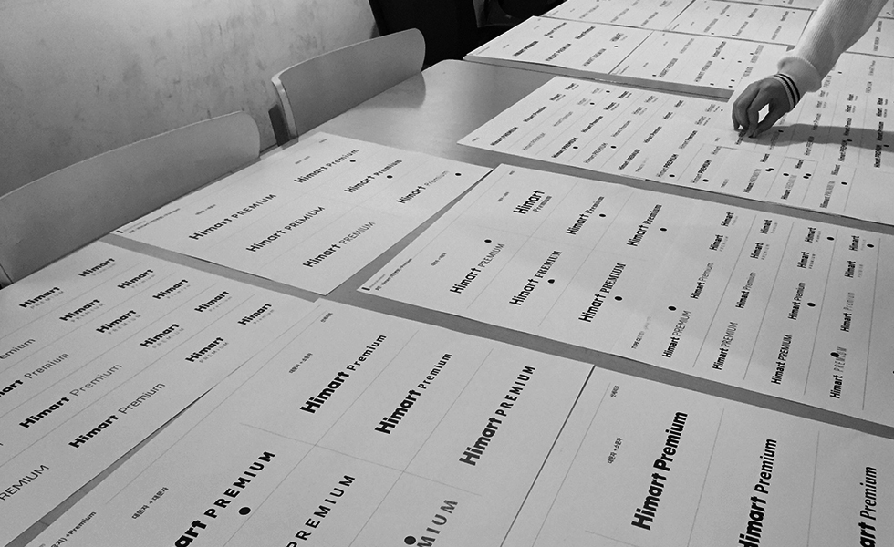
The brand identity was designed to be reminiscent of a salon lounge, where one can warmly welcome the Himart brand inside. Adjustment of lighting and introduction of black and gold, in addition with a condensed Gothic font, gave a premium image to the logo.
Application Design
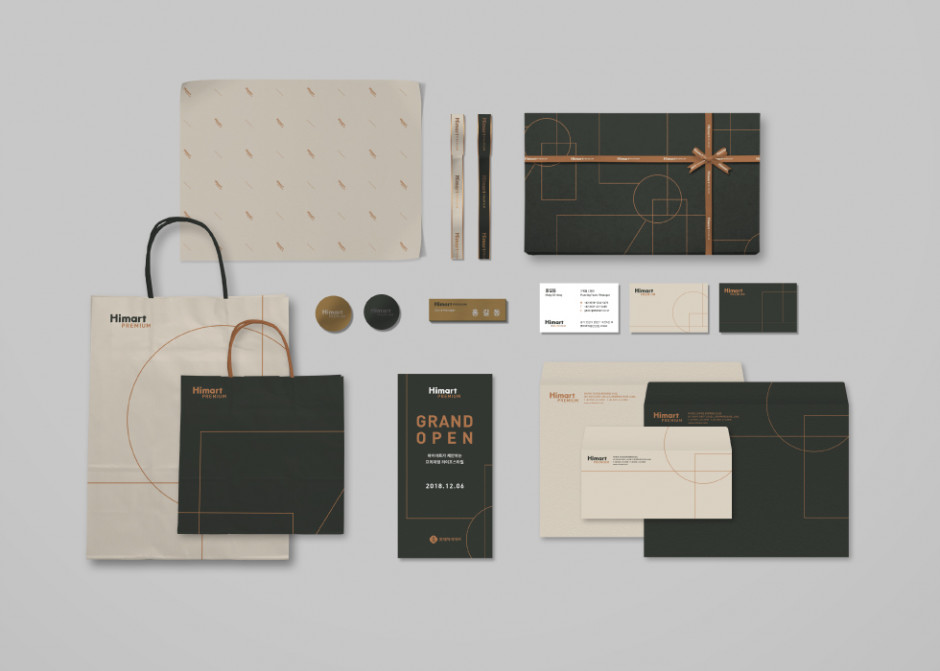
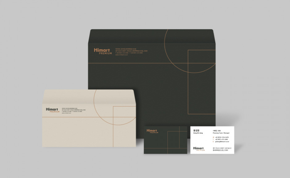
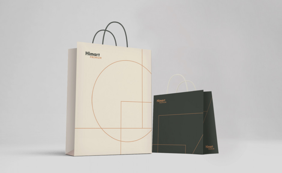
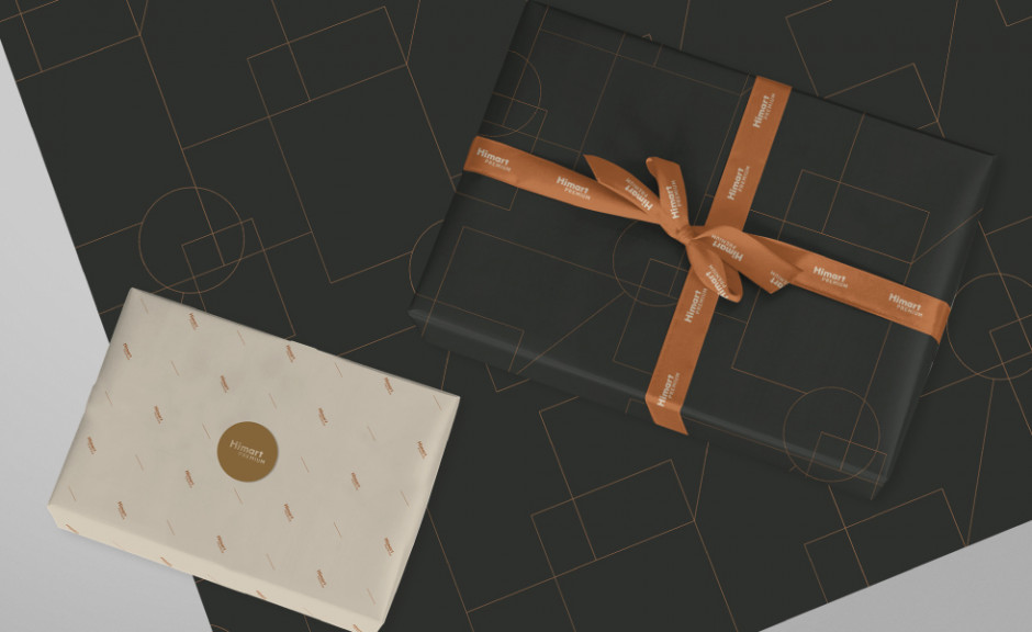
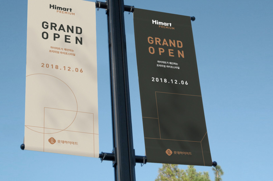
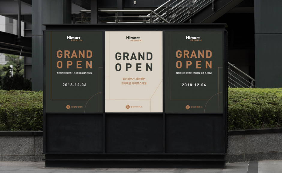
We designed a variety of mockups using the new Himart Premium branding. The pattern in the designs was developed based on the spatial characteristics of Himart Premium. This pattern was applied to various media to deliver a consisted brand image.
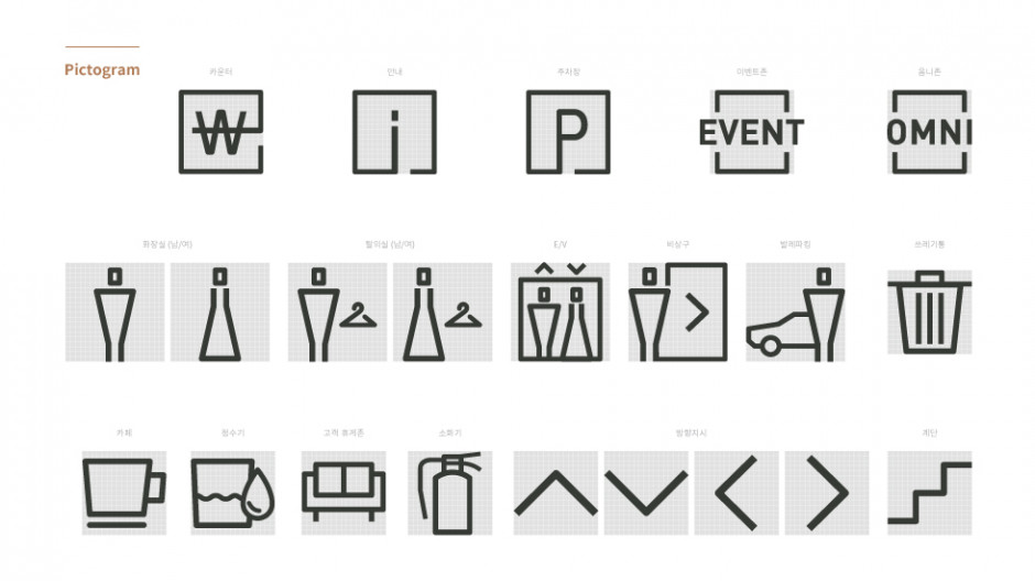
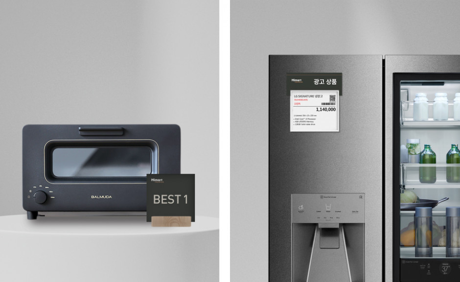
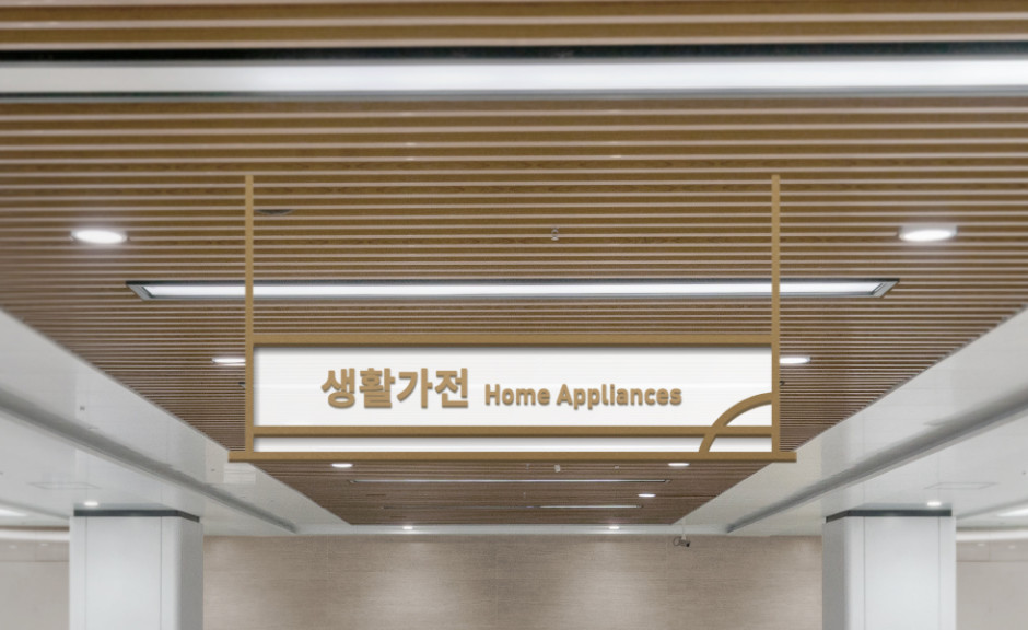
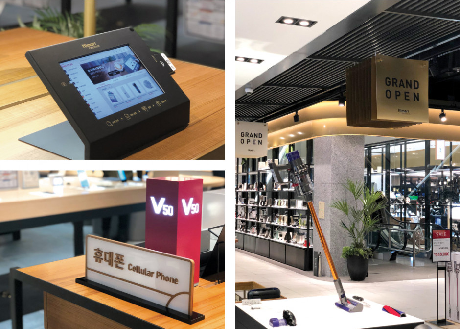
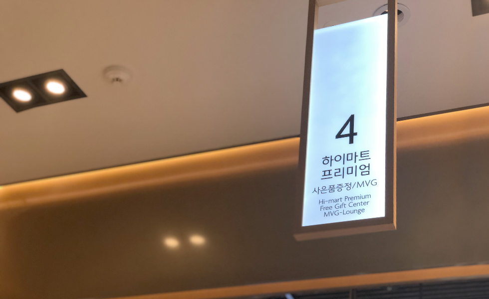
In-store signage systems were designed using gold frames, giving a high end feel, which is also reminiscent of the patterned design.
Client
LOTTE Himart
DAEHONG COMMUNICATIONS
Design
Naming & Logo Design – Perception
Experience Design – Perception
Signage Design –
Perception
SI Design – Listen Communication

